:format(webp))
:format(webp))
Tailwind CSS and Design Systems: A Practical Playbook for Teams
This article walks you through when and how to use Tailwind CSS inside a design system, plus operational patterns that rarely show up in top-ranking guides — multi-brand theming, enterprise governance, token sync with Figma, accessibility-first utilities, migration tactics, testing and performance tradeoffs, and cross-platform alignment. Read this and you’ll have a concrete checklist for planning, building, and running a Tailwind-powered design system at scale.
Why Tailwind maps well to design systems
Tailwind’s utility-first approach gives teams a set of constrained primitives (small, composable classes) rather than prescribing specific components. That makes it easy to enforce consistent spacing, colors, and typography from a single configuration file while keeping implementation flexible for engineers. See Tailwind’s utility-first approach for details.
You can also use Tailwind as the implementation detail of a design system — the tokens and constraints live in your Tailwind config while higher-level components or design docs remain the single source of truth.
Tailwind’s utilities let you encode design tokens directly in a single theme config; learn more in the Tailwind CSS Wikipedia overview .
You can abstract repeated patterns into component classes with `@apply` or into UI component libraries that consume the same theme
Pros, trade-offs, and where Tailwind is the “sweet spot”
Tailwind accelerates consistent, token-driven UIs, reduces cognitive overhead around naming, and limits the API surface of custom CSS, making it well suited to product teams that want tight visual constraints with high implementation speed.
When to prefer Tailwind:
Teams that value fast iteration and consistent tokens across many apps.
Projects where a constrained set of utilities is acceptable and designers and engineers can align on token choices.
When to be cautious:
Very bespoke visual languages where every component must be visually unique.
Teams that lack governance for classes, accessibility, and design review.
Core implementation patterns
Theme-as-config: Keep your color, spacing, type scale, and breakpoints in `tailwind.config.js` so every app and component reads the same tokens.
CSS variables for runtime theming: Expose tokens as CSS custom properties to implement dynamic themes (dark mode, brand overrides) without rebuilding CSS, following this dynamic theming pattern .
`@apply` for component-level abstractions: Use `@apply` to collect related utilities into semantic classes when components repeat often.
Components + Headless primitives: Compose accessible behaviors with unstyled primitives from libraries like Radix UI and style them using Tailwind.
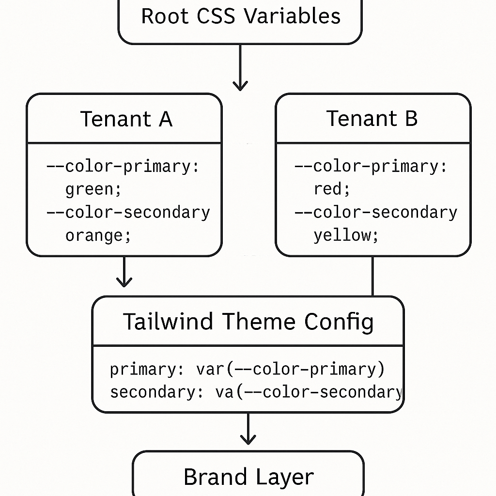
Multi-brand and white-label strategies (practical patterns)
Scaling a single Tailwind codebase across multiple brands or tenants requires a repeatable theming strategy:
Use CSS variables at the `:root` or per-tenant container and map Tailwind tokens to those variables, enabling on-the-fly color and scale swaps via CSS variables theming .
Keep brand overrides minimal in `tailwind.config.js` and prefer runtime overrides to avoid a combinatorial explosion of compiled classes.
Provide a “brand layer” that maps brand tokens to canonical tokens and run small per-tenant style packages that supply only CSS variable values or a tiny theme extension.
Governance, linting, and design ops at enterprise scale
To keep constraints enforced across many teams, make Tailwind part of your governance toolchain:
Linting and formatter rules: Use eslint-plugin-tailwindcss to maintain consistent class order and warn about disallowed utilities.
Accessibility rules: Integrate axe-core accessibility checks in CI to catch contrast and semantic issues early.
Pull request gates and code owners: Enforce design token changes behind a review by design-system owners and require visual regression checks for component changes.
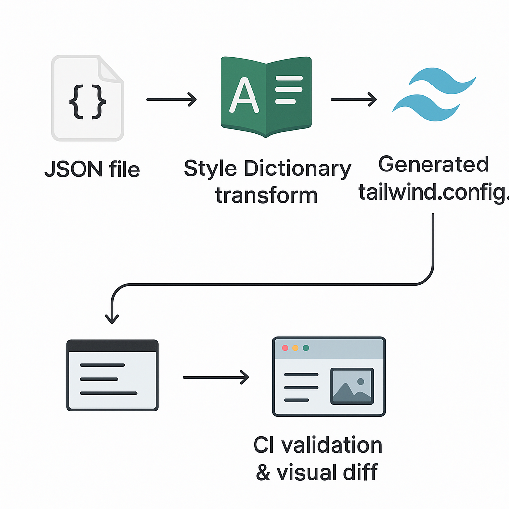
Bridging Figma (or Tokens Studio) and Tailwind: automated token pipelines
Keeping design tokens in sync is one of the hardest operational problems. Useful patterns:
Use a tokens plugin to author tokens in Figma and export them in JSON, such as the Figma Tokens plugin or Tokens Studio .
Transform token JSON into Tailwind config via a build script or Style Dictionary so both design and code read the same values.
Automate the pipeline and validate: add CI jobs that verify token exports compile into a valid `tailwind.config.js` and run a visual diff on a sample component to detect drift.
Accessibility as a first-class concern
Tailwind can encode accessibility variants and make them easy to apply:
Focus states and focus-visible: Use Tailwind’s variants and prefer the semantics documented in MDN :focus-visible .
Motion reduction: Provide `prefers-reduced-motion` variants and offer non-animated fallbacks when users request reduced motion.
Color contrast and token policy: Define color pairs in the design tokens that meet WCAG contrast requirements and block token changes that drop below thresholds via automated tests.
“Tailwind works best when it’s treated as an implementation detail of a design system — the system’s tokens and constraints belong in design, and Tailwind enforces them in code.” — paraphrased from the Headless UI blog
Ecosystem choices: adopt, adapt, or replace component kits
The Tailwind ecosystem (shadcn/ui, Headless UI, Radix) lets you stand up component implementations fast. But each adoption carries trade‐offs:
Adopt when the kit’s behaviors and semantics match your needs and you can theme it without heavy forks.
Adapt when you need the accessibility and behavior primitives but must restyle heavily to match a unique visual language.
Replace when the kit’s defaults add too many constraints or couple you to a conflicting visual style.
Explore libraries like shadcn/ui for prebuilt component sets.
Versioning, migration, and codemods
Design systems evolve. With Tailwind you’ll need practices to change tokens, deprecate utilities, and migrate apps:
Use deprecation flags in your config and keep a migration guide that explains rename mappings.
Run codemods with tools like jscodeshift codemods to update usages across many repositories.
Keep a changelog and a migration checklist per release so teams can adopt changes incrementally and test in isolation.
Modern CSS features: container queries, fluid type, and view transitions
Tailwind can wrap modern CSS features or you may author utilities for them:
Container queries and fluid typography are now available in browsers—see support tables on Can I use: CSS Container Queries .
The View Transitions API can be combined with Tailwind’s utility classes for smooth page transitions—refer to the Web.dev guide on View Transitions API for details.
Performance and developer experience trade-offs
Large Tailwind configs and many utilities can affect build times and developer workflows. Key considerations:
Use Tailwind’s content configuration to keep final CSS small by only shipping classes you actually use.
The Just-In-Time compiler reduces build size by generating only used utilities; learn more in this Dev.to deep dive on Tailwind CSS 3.0 .
If you create many custom utilities or runtime themes, prefer runtime CSS variables to avoid regenerating huge style bundles per theme.
Cross-platform and non-product contexts
Web + mobile: Align tokens across web (Tailwind) and mobile using NativeWind for React Native so spacing and color tokens map 1:1.
Email and marketing: Use dedicated toolchains like the Maizzle framework that integrate Tailwind-like tokens for email HTML templates.
Isolate marketing or campaign pages that intentionally deviate from the system using a sandboxed set of styles and clear ownership rules.
Testing, QA, and preventing “utility soup”
Useful testing and conventions to keep a design system healthy:
Visual regression testing with Percy or Chromatic snapshot tests to catch unintended visual drift.
Class-level lint rules and a whitelist policy to prevent teams from sprinkling disallowed utilities in product code.
Storybook as the single catalog of components, with tokens surfaced in docs so engineers and designers reference the same examples.
Onboarding, documentation, and knowledge retention
Tailwind’s productivity gains are only lasting if you lock in knowledge:
Keep a short “how we use Tailwind” guide with examples: permitted/disallowed classes, component abstractions, theming steps, and token-change process.
Run hands-on onboarding workshops and recorded demos for both designers and engineers; include sample PRs that change tokens so reviewers know what to look for.
Store long-lived decisions in a design-system changelog and searchable docs so new hires aren’t guessing about tribal conventions.
The migration playbook: from BEM/SCSS or an existing component library to Tailwind
If you already have a large SCSS/BEM system, migrate incrementally:
Identify high-value components to rewrite first (top navigation, buttons).
Create Tailwind-based component shells and a token mapping document.
Use codemods to update import and classname patterns where possible.
Keep both systems running while teams migrate feature-by-feature and deprecate the old CSS gradually.
Migration Step | Description |
|---|---|
1 | Identify high-value components to rewrite first (top navigation, buttons) |
2 | Create Tailwind-based component shells and a token mapping document |
3 | Use codemods to update import and classname patterns where possible |
4 | Keep both systems running while teams migrate feature-by-feature and deprecate the old CSS gradually |
Final play: Run the system, not the framework
Tailwind is a tool that enforces constraints when the constraints are well-defined, documented, and governed. The design system remains the product — Tailwind (and its ecosystem) is the implementation. Make governance, token sync, accessibility, testing, and migration part of your plan from day one. That approach saves engineering time, prevents visual drift, and keeps your UI consistent across brands, platforms, and teams.
:format(webp))
:format(webp))
:format(webp))